YASMINE, JAHMAL & ALI - '1234' FINAL VIDEO from cmdiploma on Vimeo.
Saturday, 20 March 2010
Friday, 19 March 2010
In what ways does your media product use, develop or challenge forms and conventions of real media products? (Part One)

1) In Shot 1 there is the performer sitting on the piano, alone. There is a faded layer over the top to represent her memory; in this layer there is the performer and a boy playing guitar. This represents the lyric "Money can't buy you back the love that you had then", because the performer is now alone and in the memory she is smiling and happy.
2) This is what I think the record label would want their artist to be represented because she looks very quirky in a vintage looking, blue, polka dot dress; she looks calm and laid back. She is in a pure white room full of musical instruments, to show that she is creative. She also stands out in the room. The style of clothes also helps represent her music genre - acoustic/ indie folk.
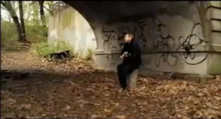
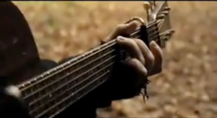
3) In shot 3 there is another performer playing acoustic guitar, against a tree, outside in the woods. This represents the genre because is has the laid back acoustic look, because he is playing acoustic guitar. It also represents the Indie Folk genre because of the style of clothing and because of the setting - when we think of folk music, we think of traveling bands, outside, around campfires etc.
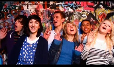
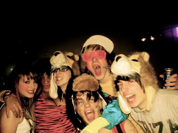
4) For shot 4, I've decided to make an intertextual link to "Teenage Life & Youth Culture". This is because here are a group of teenagers smiling, dancing, having fun and just enjoying life and their selves. The reason I've linked it to Teenage Life is because I found this photo and I thought there was a strong connection between the two. Most people look down on teenagers today, and I believe that this picture completely contradicts their opinions, because we are all we dressed, friendly and not vandalising etc. This is how much teenagers actually are - happy and inviting.
5) This shows camera work because this shot was a free hand/ hand held shot of panning of the ground, which then follows up to the performers foot (taping), which then pans up to the guitar and performers face, and upper body. This is one of the most interesting camera shots I've seen, and I think it works so well because it was a risk that Jahmal took.
6) In our video all the lighting was natural because we wanted a really down to earth, and natural atmosphere to it; however for shot 6 I decided to show what shot we actually used set lighting for. The single light, from behind the camera, made such a difference - the colours became brighter and the whole atmosphere seemed to become more positive too. Behind the camera was also a huge window which let in a lot of natural light too.
7) I've also used the studio scene for shot 7 to show the mise-en-scene. The studio scenes were the perfect scenes for me because they had a perfect back drop, lighting, and the colours look gorgeous all together. In this shot the back drop really compliments the happy/ fun atmosphere we wanted for our music video. This shot also shows the outfits people were wearing - mainly blues, whites, navys which work great against the bright and crazy background. This shot also shows the expressions of the characters, smiling and dancing which completes the friendliness of the mise-en-scene. We had the most control with this set compared to the others, where we wasn't allowed to move anything, or we couldn't control the weather etc.
8) This shot really links to a shot from City & Colour - The Girl music video. His music is also from the acoustic genre. This kind of shot is very common, in this music genre, with the performer playing a guitar outside in a natural/ woodland area.
9) This shot also links to City & Colour's music video. In acoustic genre music videos it's very important to get the musical instrument (Acoustic guitar) in because the music is a huge inspiration and influence to other acoustic artist and fans. This shot looks almost similar to one from City & Colour.
Thursday, 18 March 2010
In what ways does your media product use, develop or challenge forms and conventions of real media products? (Part Two)

1) This is a screen grab from the music video "The Good Life - Kanye West feat T Pain". I've chose this image of Kanye with the animated background of New York with King Kong, Empire State Building, Statue of Liberty and Yellow Taxi Cabs (all very iconic ideas of New York). The lyric is "It Feel Like N.Y" - therefore the link with the background and the lyrics is that, as soon as you see the background you automatically think of New York City.
2) In the "Neapolitan Dreams" music video, the record label wants to show of Lisa Mitchell's quirkiness and also her style, because that really attracts the audience because she is visual interesting through her clothes and personal style. The record label would want to create this of pure and almost fairy tale atmosphere so the audience is intrigued and engaged by the artist, because of her acoustic, calm, peaceful and girly music genre.
3) Tonight is Goodbye's, Brain Music Video, shows off their Rock/Indie style because of their band performance, which shows them all playing energetically with their instruments; creating this huge LIVE gig atmosphere that is a common convention with music videos from the Rock/ Indie genre.
4) Shot 4 is also another Tonight is Goodbye Music Video (Fire In The Hole). I chose this for my intertextule reference because when I first saw the video I automatically thought of the iconic boat scene from Duran Duran's Rio Music Video. The style of the clothes, especially the lead singer in the cream blazer's really just show such a strong similarity.
5) I've chosen a shot from Jamie T's Sticks 'n' Stones Music Video to show camera work because there is something about this shot that is very unique. Most of the video is in a hand held style; this shot is of the artist singing the lyrics while running along side the train, and the camera looks back at him through the window as the train pulls away. This camera work is very raw and really works with the whole style of the video.
6) This is Jamie T's Man Machine Video; The lighting to this shot is perfect - the lights from the busy street below contrasts with him singing into the camera, with a single light from above. Even though there is the single light above of the artist/camera, we are made to believe that the light is coming from the street below. There is also a real sense of reality in this shot, no studios, just life.
7) Marina & The Diamonds Hollywood video creates perfect mise-en-scene of America. It has all the connotations of America (in the entire video) but in this screen shot there are tiny American flags, the performer is wearing the american flag in part of her costumer, all of the extras are dressed in red, blue and white (american flag colours), people dressed american icons and classic american figures (marilyn monroe, elvis, cheerleader, jock etc). The set is a very posh room (chandelier) and when the video starts it is in "the white house".
8) This shot is taken from Jamie T's Sticks 'n' Stone music video. It is the performer (right) and his best mate dressed up as a clown. This shot really reminded me of The Arctic Monkey's - Florescent Adolescent music video because of the friend & clown outfit.
9) This shot from Kanye West & T Pain's "Good Life" links to the Justice "D.A.N.C.E" music video because it is created by the same graphic designer - So Me. The animation and writing is a common convention in So Me's work, therefore the two link because of the animation and also the electronic influence in the music.
2. How effective is the combination of your main product and ancillary texts?
Below are some screen grabs from our music video and my digipak/ poster.
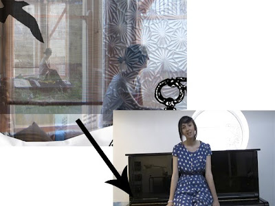
The comparison in this shot is that the performer is sitting alone in a white room, near a window letting in lots of light. In the digipak the performer is also sitting alone, looking out of the window. In the music video this shot goes into a memory scene. Therefore these two shots link because they both show the performer sitting alone reminiscing old memories.
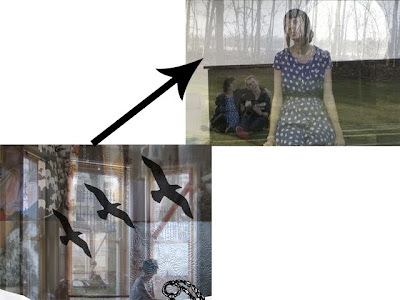
The comparison between these shots is that they both feature the "faded" effect. The both also show the performer sitting alone, but they have other images within, for example the music video has the image of the performer and a boy sitting together, and the digipak has the images of textures and dressing table bits. The faded effect really does add something extra to these shots.
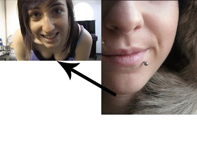
The comparison between these shots is that they both have the happy emotion behind them. They both have the close up of the face showing the whole emotion of the smile and happiness.
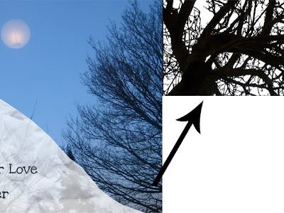
This shot is a really simple connection - the tree silhouette. I've linked these because the of the strong outlines of the tree's branches against the pale skies. The effectiveness makes the comparison strong and memorable.
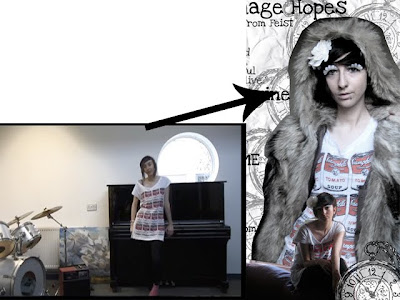
This is also another simple comparison, which is the outfit. The white dress, with the Andy Warhol Campbells soup can print, features in both and they are really strong against the pale white background, and make the poster and music video stand out.
The reason for this last screen grab is that the whole atmosphere is happy. The happy theme runs throughout the whole music video and digipak/poster. I made a lot of memories during this project, therefore the memory theme is also another key element that features through this entire project.

The comparison in this shot is that the performer is sitting alone in a white room, near a window letting in lots of light. In the digipak the performer is also sitting alone, looking out of the window. In the music video this shot goes into a memory scene. Therefore these two shots link because they both show the performer sitting alone reminiscing old memories.

The comparison between these shots is that they both feature the "faded" effect. The both also show the performer sitting alone, but they have other images within, for example the music video has the image of the performer and a boy sitting together, and the digipak has the images of textures and dressing table bits. The faded effect really does add something extra to these shots.

The comparison between these shots is that they both have the happy emotion behind them. They both have the close up of the face showing the whole emotion of the smile and happiness.

This shot is a really simple connection - the tree silhouette. I've linked these because the of the strong outlines of the tree's branches against the pale skies. The effectiveness makes the comparison strong and memorable.

This is also another simple comparison, which is the outfit. The white dress, with the Andy Warhol Campbells soup can print, features in both and they are really strong against the pale white background, and make the poster and music video stand out.

The reason for this last screen grab is that the whole atmosphere is happy. The happy theme runs throughout the whole music video and digipak/poster. I made a lot of memories during this project, therefore the memory theme is also another key element that features through this entire project.
Wednesday, 17 March 2010
3. What have you learned from your audience feedback?
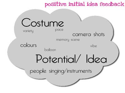

I remember being really pleased with this feedback for our initial idea for 1,2,3,4. Looking back on this it made me think of how we stuck to our original idea, but simplified it. I think we took all of their concerns (bottom) on board and tried to to answer their questions. I think that the simplicity of our idea made it a lot more easy for the audience to believe and give us clear feedback.


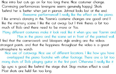
The feedback for our rough cut was exactly how we wanted the audience to react. They all felt really happy, and understood the concept. We knew that the video wasn't what we wanted so the improvements were fair because we needed to re-lipsync certain parts, and some parts were held for too long etc, but it was nice to have reassurance of what needs to be improved.

The digipak feedback was also reassuring because I was proud of what I'd accomplished but I liked that the audience understood the link between the font and the paper effect. Also they all appreciated the digipak which they would be the target audience for.
This feedback was a nice surprise. I'm still glad that everyone understood the concept and also that the comments made keep improving, because everyone seemed to appreciate the rough cut, and they seemed to like the video even more. I didn't realise that the lipsync was a bit off, and if we had more time I'd obviously go back and improve this. We converted our mp3 to an avi file because we'd gotten use to the "popping" sound that the audience had picked up on, therefore that's probably why our lip sync is slightly out. We didn't realise that some shots are too long, because we were editing to the beat and syllables (in the verses). Overall I'm over the moon with the feedback that our final video has received.

This feedback is fair. However I have to argue against some of the points. I have to disagree with the similarity to the music videos. The official 1234 video is filmed in one continuous shot, with dancers in colourful outfits, performing a dance routine including the performer, who is in a blue sequin jumpsuit. The only similarities between these videos is the fact that both performers have brown hair, and are wearing blue. In the sesame street version the only similarities are the fact that at one point there are six people who sing and wave the heads like in our video. Maybe the main similarity is the happy atmosphere between both videos. However the points are appreciated and I do take every criticism on board.

This feedback made me very happy. It was completely out of the blue after I posted my music video on my personal blog and asked for people to watch it, and to "feel free to give feedback". I don't really talk to Sam about my media work, so for him to tell me that he understood the happy theme and it made me smile, made me feel like the concept was accomplished and to make people feel happy is a great feeling. He also saw the lipsync out of time, so I was expecting that comment.
Overall I think we took on board all of our feedback and tried to make it fit around everyone - I am extremely pleased.
Tuesday, 16 March 2010
4. How did you use new media technologies in the construction and research, planning and evaluation stages?
Below are the things that we used to create our music videos for this project.


1- Photoshop: This is where we created our digipaks and also any kind of graphics. This came in handy when we first started the project and created our shapes video. It was really easy to manipulate photos on and piece together our digipaks.
2- Blogger: This is where we wrote all of our posts and homeworks/courseworks. It was really useful for our music video research because you can upload and embed pictures and videos.
3- iTunes: Where we uploaded and listened to music from the artist.
4- Facebook: How we kept in contact and also to look at fan pages/ contact the artists.
5- Myspace: This is also how we contacted the artist, and listened to their music.
6- Google: We used Google to search for other sites.
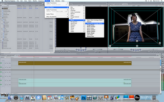
7- Final Cut Express: This is how we edited all of our videos for this project.
8- Flickr: We used this to upload our photos from class and on set; we also uploaded our digipaks and posters onto here.
9- Youtube: This is how we researched other music videos.
10- Vimeo: This is where all our video work was stored.
11- Wikipedia: We found out a lot about the music video history, genres and information about the artists etc.
12- Safari: This is how we accessed the internet.
13- Creative & Media Music Video Blog: How we accessed our blogs via blogger.
14- CRAM website: This is how we accessed the different Long Road links, such as vimeo, blogger, youtube & flickr.
Sunday, 14 March 2010
If I had more time...
and if the weather was nicer, here is a list of things I would change about my music video.
- Reshoot the outfit scene. Either in the same room but obviously get permission to move the objects and instruments so it was our own set up; this would also give us a chance to hide the plug socket and the radiator etc. Also it would've been nice to try the outfit scene outside in the art quad; because then the performer would be moving around the fountain. If the weather was nicer then that shot would've been perfect, and a theme of happiness and nature would also be consistent.
- Reshoot scenes of Rob - only close ups and cutaways because Ali & Jahmal didn't have the song, so therefore Rob had to play and also sing because then they could lipsync the guitar easier; however they forgot that when they lipsynced it all up, in some shots, Rob would have a woman's voice! So it would be nicer to get him to play at the same speed with the song to guide him, because we had to cut out so much footage from where it was out of time etc.
- Get some footage of Rob & Myself walking through the woods/ outside. Nick was talking about the relationship between both performers in the video; most of our peers didn't notice/ weren't bothered that the only place the two performers were scene together was at the end in the studio scene. To have this extra footage of both of us, would've been nice to mix into the second verse.
- Editing - Just to discover different effects and to get everything super neat and professional. Maybe even produce a second version, with the different piano bit in it.
Overall these changes are minor! I'm so pleased with our music video!
DigiPak Photos
I've decided to upload my images onto Youtube in a slide show, because they was too many images to upload directly onto here; I would also have to convert them to smaller sizes otherwise they'd be huge file sizes taken ages to upload!
Extended time on Digipak?
I'm over the moon with my Digipak & Poster; the comments I've received just make me even more proud.
However if we did have more time I would do a completely new photo shoot.
More like the one I originally planned.
I would do a photo shoot that relates to the happy atmosphere in the video.
I would go to small little cafes in london and take pictures there; I would have really sweet outfits made up of pastel colours; I would want it full of cupcakes & sweets and make everything really over the top girly and cute!
Therefore I'd have two completely contrasting albums for the audience to collect. This digipak would also contain different bonus features, for example, posters, stickers and a free dvd of the making of some of Feist's music videos.
I would also do a campaign because that's what I really wanted to do!
I'm slightly annoyed that I wasn't able too; however I did have time in lesson (on Thursday) to start the lyric book. I would definitely finish the whole booklet if I had additional time.
Deadline Day.
On Friday we spent the whole day working on our to do list (previous post).
2. On Friday, Jahmal & I worked out an easier way of keeping the faded background, that everyone commented on with positive feedback, by copying the layer 2 or 3 times, cropping it down and laying them up over the plug, so that it disappeared.
The second thing we did is work on a certain shot of rob.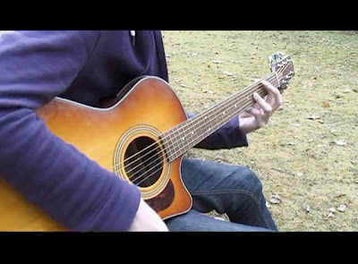
Firstly we decided to work on masking the plug during the "memory/piano" scene.
Luckily, we had two options:
- On Wednesday, Jahmal & Ali worked on masking out the white background, so it gave the appearance of the piano being outside. This was a really good idea, and considering they didn't have long to do it, the outcome was surprisingly good.


2. On Friday, Jahmal & I worked out an easier way of keeping the faded background, that everyone commented on with positive feedback, by copying the layer 2 or 3 times, cropping it down and laying them up over the plug, so that it disappeared.
Overall, we decided to go with the second option because it was much more effective than the option 1. We managed to make the plug socket fade, and it was so much less noticeable. At the same time I was really gutted about not using the option 1 because all the white was gone, but at the same time it looked a little bit silly with the backgrounds we'd chosen to use, and some of the performer was actually faded as well.

When Pete watched it the other day he mentioned to us a few shots that were held for too long. This was really helpful for us because we didn't realise until we sat down with Pete. We decided to start with the original shot, then into a close up of the stings being strummed and then into a close up of the chords being played. This works a lot better now, and gives it an authenticity.
Pete also mentioned a long clip during the outfit changing scene - the clapping one towards the end. He said that we'd built up so much fast, energy that the clapping shot brings it down. So we decided to just use quick shots from all the outfits so that on the claps I change outfits/ places still.
Steve helped us a lot with the actually track. We'd listened to the song so much that we hadn't noticed that the version we had (mp3) had a horrible popping sound, which was really uncomfortable for the viewer, and would sound disgusting at the picture house; so Steve gave us the avi version which was a lot cleaner! He also said about some of out shots during the instrumental near the final part of the song, so removed the pebble cutaways and the video looks a lot better now!
Nick mentioned going through the whole of the "outfit" segment and masking out the plug socket. This was a good idea, but in the end we didn't have enough time to do it because of the creeping deadline, which is actually really annoying and upsetting.
He also said about the whole mise-en-scene in that part. We couldn't do anything about it, purely because that was the only place we could film; we literally had under an hour to film, and we had strict orders not to touch/ move ANYTHING. If the weather hadn't of been so shocking then we could've filmed outside, but then again if this song is suppose to be uplifting there's no way anyone would want to watch someone singing in the grey! For example, the colours in our test footage are awful!
At the end of the day I'm so proud of what our group accomplished. We really came together to make something that I would be happy to show anyone.
Friday, 12 March 2010
Thursday, 11 March 2010
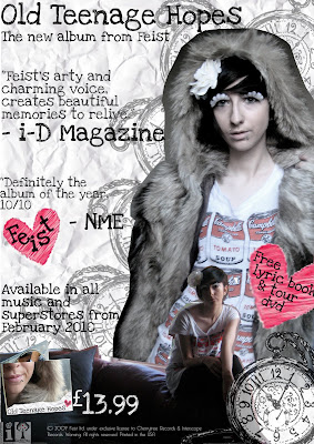
Final Digipak.

This is the front (right) and back (left) cover of my Digipak. I haven't changed it much at all since the draft because I was really happy and proud of what I'd accomplished. The changes I've made to this are - Artist name in heart; album name/artist on spine; copyright material and record label logos on back.
I've kept the colours really neutral and I believe they look slightly pure (Almost).
The front cover is probably one of my favourite images I've taken, because I just feel like it is pure emotion. While I was taking this photo I was trying to reminisce old summers, and being back with all my friends at my previous school. The note/crumpled paper, is suppose to represent the "passing/ leaving notes" theme.

This is the inside of my digipak. I've also added copyright material to this as well.
Unfortunately I couldn't find the original of the drawing of the watch, which is a shame. I think it's on my laptop at home, because I do not have all of the files on my college computer.
I've kept this simple as well.
On the left there are multiple images of textures and the artist, very lonely, looking out the window, thinking of old memories. Then the 3 bird - flying to signify freedom.
The right side is like the ash tray. Many people have commented on how "it doesn't relate" but I think it's more relevant. When I think of teenagers I think of parties, friends, memories, and smoking, rebelling etc. Therefore if the album is "Old Teenage Hopes" then this connotates the whole gritty, experience of being a teenager; maybe the artist used to sit on the school field with her friends and smoke? These are suppose to be echoing her memories.

I've added the copyright labels etc and the actually digipak at the bottom left as well. To relate to the digipak I've added the little hearts - 1 saying FEIST and the other explains what comes with the digipak.
I happy with this poster; I'd definitely stop and look at it, in HMV or even on the street.
The colour scheme is very simple, just like the whole campaign. The whole theme is very pure with a certain coldness to it. Like the memories, some could be so cold, and raw with emotion that this is whole they come across.
The font is also consistent throughout the whole campaign.

This is just a little something extra. This is a sample of the fold out lyric book.
I wanted the teenage, nature meets crumpled paper theme to run through still. I've used polaroids and the photograph of a phone number written on someone's arm, but then where it has come into contact with water/liquids half of the number's been rubbed off.
I love having that picture in there because that is such a common thing that happens to teenagers; you meet someone, they give you there number, email etc and you loose it or it gets destroyed. Therefore you're left with the uncertainty and not knowing feeling, that we've felt all felt, especially at some point while being a teenager.
The front cover to the lyric book will be the front cover of the digipak, because that is very common with other lyric books. The bonus DVD will be on the same disc as the CD.
Thursday
The digipak is due today, and at the moment I'm just double checking I've got everything I need on there. 
My main worry is the poster, so I googled "digipak posters".
This image came up:
This is Feist's "The Reminder", but it seems to looks like a digipak or inside booklet.
I love the simplicity of the photos and designs.
Really cool.
Tuesday, 9 March 2010
Marina & The Diamonds
Okay, I think this video is beautiful.
I'm not a huge fan of the song, but just look at the mise-en-scene and the colours and the cinematography. It's gorgeous!
I like the mixture of the slow motion, and natural (party) shots towards the end!
I LOVE THE COSTUMES.
ALL OF THEM.
I just think this video is great; it has everything that a music video needs:
fun; great set; amazing costumes; convincing performer; fun; variety of shots; amazing camera!!!
The song's called Hollywood;
American queen is the American dream
She is a Polish girl in America
Tall, tanned hot blonde called Anya
I asked her ‘Why would you wanna be a hollywood wife?’
“Because I don’t want to end up living in a dive on Vine”
I’ll do anything for a dime
Looking for the golden lie
Hollywood infected your brain
You wanted kissing in the rain
Oh oh, Living in a movie scene
Puking American dreams
Oh oh, I’m obsessed with the mess that’s America
I’m obsessed with the mess that’s America
I fight security making plays for me
As soon as I touch down in old LA, he said,
Oh my god, you look just like Shakira
No no, you’re Catherine Zeta
Actually, my name’s Marina
Your mind is just like mine
All filled up with things benign
You’re looking for the golden lie
So basically they wanted the american theme. In my opinion... it's like everything about America in a video - the stars; style; icon; it's even based in a mini WHITEHOUSE!! Amazing!
The director of this video is Kinga Burza - a Polish director. She has made videos for similar artists like Kate Nash (Caroline's a victim/ Foundations/ Mouthwash/ Pumpkin Soup Videos), Ladyhawke (Back of the Van Video), Calvin Harris (Merrymaking at my House Video), Katy Perry (I Kissed A Girl), La Roux (Quicksand/ In For The Kill) & Noisettes (Don't Upset The Rhythm).
All of these videos are very icon, and some even boosted the artists and gave them publicity and also memorability.


Adding Copyright to my Digipak.

All of the things in Red boxes are the things I've added to my Digipak, including record label icons and text.
I've also found out Feist's own record label's she's signed to.
Pete Feedback
Today Pete viewed our work (and peer feedback) and gave us some advice and some goals to work to in the next few days.
He said about the studio shot (white dress/shirt) slowed down the pace, and we should keep to the cuts between the different outfits.
He also said about the studio scene at the end and how the audience feels like it's waiting for something to happen.
Also about the plug socket in the piano scene - we need to mask/matte it.
So for the next few days we are going to achieve:
- Go back through outfit takes, to try and find other clips to integrate in.
- Fix Studio Scene
- Try to get rid of plug socket.
We'll be (hopefully) uploading a rough cut at the end of the day.
Yas & Jahmal Feedback
Today (Tuesday) we have decided to reflect on our rough cut feedback. Ali is ill, so she can look on here and then add her thoughts later.
Jahmal's Favourite Positive Feedback:
I like how several pieces of footage are overlapped. Also how the guitarist goes from tree to tree, and when the singer disappears at the beginning part of the song.
I agree with this feedback and how the footage overlaps when Yas in sitting on the piano with all the footage faded behind her. The tree idea where Rob moves from tree to tree is also a scene which I like, because it goes to the beat. I agree that the scene where Yas claps herself away is a good shot and I think that we should keep that shot in, but we might want to add another clip in-between the shot.
Yasmin's Favourite Positive Feedback:
Cute; good opening; costume; guitarist; mise-en-scene; shots; effects; graffiti room.
I am really pleased with this comment because it gives you pride and confidence with your video. They've highlighted the main aspects of the video, that they like, which also seems to the main parts of our video, so that makes me happy.
Jahmal's Improvement Feedback:
Some of the footage was not lip-synced right; Maybe go back and improve this.
When I read this feedback I looked at our footage again and saw that there was a little part of our video which was out of sync. I am actually quite happy with this comment because now we can go back and correct this.
Yasmin's Improvement Feedback:
Unless there's like a thing you haven't put in yet that'll make it amazing, I wouldn't change much at all.
I really appreciated this feedback because it's nice to be told that someone appreciates your work. This has given us the confidence to keep working just as hard.
Monday, 8 March 2010
Monday Lesson
Today we gave every group in the class, peer feedback on their videos.
Here is the feedback for my group:
Positive:
I like how several pieces of footage are overlapped. Also how the guitarist goes from tree to tree, and when the singer disappears at the beginning part of the song.
I love the camera being in the same place, and the fads simple locations and ideas shots work really well.
Cute; good opening; costume; guitarist; mise-en-scene; shots; effects; graffiti room.
Rob shots are good. MAX SHOTS ARE AMAZING.
costume change; lip sync; the shot leading up to rob; good editing.
Costume; "party Scene"; Performance.
The first 30 seconds to min has loads of cuts and this makes it more interesting.
So many costume changes; edit of rob beginning + piano fade; looks like music video already.
Happy good lucky feel.
Nice variety of shots; good use of rob; good effects on edit; Jman's shot.
Great shots.
Good use of costume and location; Jahmal shot FTW; teleporting!
Changing spots & costume in same location, very nice! Effect with two videos looks cool; like the behind stage location.
I love the faded shot where Yas looks like she's flying.
Improvements:
Some of the footage was not lip-synced right; Maybe go back and improve this.
Unless there's like a thing you haven't put in yet that'll make it amazing, I wouldn't change much at all.
Lip sync seems out in bits; feet go on too long cut a bit obvious towards end.
Lip sync and guitar sync a bit off.
Add Yaz singing outside; TAKE MAX OUT OF IT (hannah joking)
I think the shot where you sort of see through the piano is held a little too long.
The sync is slightly off at the beginning.
Transparent stuff is best when its just in the piano not the whole frame; Jahmal at back.
Some shots are to overglodid (?)
Lip sync out in faded shot.
HD?
Some lipsyncing shots slightly off.
Lipsync sometimes not right.
Friday, 5 March 2010
Rough Cut.
This is our rough cut.
I'm really proud of what we've done today.
My favourite shot is the "1 2 3 4 5 6 9 & 10" part because we layered archive footage and cutaways over the top to look like memories.
1234 Yas Jahmal Ali from cmdiploma on Vimeo.
We still need to tidy everything up, but at the moment I like it a lot; but there's always room for improvement.
Today


THIS IS A MESSAGE FROM YAS, JAHMAL & ALI
This morning we have sorted out our footage and selected the parts we think look effective.
We have also had a talk about how we want the video (opening especially) to look overall.
We have taken a few notes about the opening.
We've used cutaways of inside and out of the college grounds.
We've tried our best to cut to the beat, without shots looking like mistakes.
At the moment we have a rough cut up to 32 seconds!!!! YAY
Thursday, 4 March 2010
OTHERS

I couldn't find the Feist digipak but here's The Reminder album - Costing £5.00 which is pretty good because the album has been out since 23rd April 2007; also Feist isn't hugely world known, however Mushaboom & 1234 are really successful!
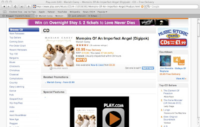

This is Mariah Carey's Digipak - she is world famous therefore spending nearly £9.00 is acceptable.


Jack Johnson is slightly similar to Feist's genre. Paying £3.22 is quite low for someone as talented as him, but you can see the differences between the genres and the fame.
TEEN CULTURE


"Teen pop is a subgenre of pop music that is marketed and oriented toward teenagers and preadolescents."
(More to come)
Digipak Design 2?
I had a talk with Nick today and he complimented my digipak, claiming that it had a "Lady Gaga, Ice Queen" theme and outfit. However he said that it's not very true to the video.
I argued this point with "Maybe I dressed like that in other videos? This is for the whole album not just that one video.
moreeeee to come
Thoughts on Digipak.
I've learnt to appreciate everyone's work; all of the digipaks I've looked at today have shown a lot of talent and effort! They all reflect to their artists genre and style. 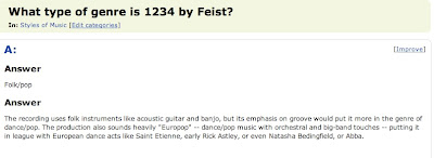
Above is the audiences personal answer on the artist's genre. The all say that it's very folk/ acoustic/ pop. The style I have used for the digipak is very simple and hopefully connotates to Teen Culture. Therefore I've used this style of "passing notes in class" and "leaving notes to friends/boyfriends/ girlfriends or whoever in the morning" is what I've tried to represent here.
"Pop rock is a mix of pop music and rock music utilizing a catchy pop style with light lyrics, and (typically) guitar-based songs. There are varying definitions of the term, ranging from a slower and mellower form of rock music to a subgenre of pop..."
Also Wikipedia says:
"At the 2008 Juno Awards in Calgary, she was the top winner with five awards, including Songwriter of the Year, Artist of the Year, Pop Album of the Year, Album of the Year and Single of the Year"
Juno is really quirky and highly relative to Teen Culture. Therefore being awarded with 5 awards shows have relative Feist is to Teens.
I need to add the copyright text and the record label logo! I was thinking of maybe putting them on the inside though because I want the album covers to look simple and I honestly wouldn't change much about them, so I don't wanna over complicate the composition of the front cover.
Today I will most probably add the little things that make digipaks (record label logos etc) and I will also add the artists name into the little heart on the front cover, to keep with the cute theme.
Digipak Feedback.
Today, in class, we had a chance to look at everyone's digipak and give them some feedback.
The front and back cover look really good.
The front works well with the paper background.
The back cover does not have any copyright text.
If you fade the back cover pic with the front pic.
Good choice of images.
The crumpled paper looks good with the hand writing font.
Agree with the crumpled paper and font.
Nice composition.
Might need a record label logo.
I'm really pleased with my feedback; I didn't think it would be this positive!
I'm glad people like the connection between the crumpled paper and the font, because I feel like it reflects the artist and the style of music.
I also agree about the record label logo and also the copyright text - I completely forgot about the little touches and well add them to make the digipak look legit.
Tuesday, 2 March 2010
CAPTURE & MORE SUN
Today we were at Coleridge capturing our footage from the week before.
It took us nearly the whole lesson to capture all the footage, which I loved because we could watch all of our parts thoroughly and it showed how much footage we had, and we could see the potential there.
During the second lesson we went through the different segments (inside/ outside cutaways/ outfits/ studio/ rob shots/ test footage/ lipsync) and split them down into the different cuts like Midshots, Long shots etc.
I'm glad we spent all the time looking through footage; it really helps because you can review all your work and already go through the clips and decide what would look good where.
However I'm a little bit concerned/ worried because we have so much footage of rob, which is full of a variety of shots, but he's lipsyncing in most of the clips; this could ruin some of the shots because it'd look as if he's got a woman's voice! The shots are so good as well, so now we're limited to shots because we need to make sure the lipsync isn't in it. We can still use all the close ups of guitars and stuff though!
When we went back to Long Road we learnt about Record Label's and the Music Industry.
Monday, 1 March 2010
Monday - SUNNY DAY
Today was the reschedule for Emma/ Rob/ Christina's group!
The weather was great and sunny which really made the tea party scene!
I think their footage will turn out well, and it was good to be a part of.
I'm glad all our footage is done; shooting was so stressful because of the weather.
Tomorrow we'll start editing! YAY!
Friday
On Friday we came in early to try and get everything sorted and finish our music video shooting.
We spent the first lesson looking for an inside location to shoot in because the weather was terrible, as per usual. After about an hour of trying to find a location we went up to B102 to ask Steve for advice. He suggested that we shoot behind the stage and he would supervise us!
Steve was so much help! SO A HUGE THANK YOU TO HIM!
By the time we got permission and the hall unlocked it was 10.50 and a few people had turned up (Emma, Max, Rob, Tilly) and obviously my group. We filmed the ending and the atmosphere was really good. We also filmed so natural footage and everyone walking up to the camera, posing and the looking like the walked into the "party".
Afterwards we went to help film the "Tea Party Scene" for Emma/Rob/Christina's group. The weather was awful and characters had to leave so they ended up rescheduling for monday.
Jahmal took the tape over to Coleridge to capture it.
Thursday, 25 February 2010
MORE PLANS.
Tomorrow is pretty much the last day of filming, so we're coming in early to film the memory scene with Rob and myself. I'm quite excited to get this done, and play around with the different depths and compositions.
We're all needed for Emma/Rob/Christina's video so we'll go and help them out and then in return they could help us out with the studio/end scene, where we need some people to be there. This wouldn't take long because it's mostly close ups of feet/ hands etc.
Today I wasn't in because I've been ill. I have no time to rest so I keep getting worse! But I did come into Cambridge at 1 to help out Hannah's group at the Junction.

Wednesday, 24 February 2010
PLAN
Tuesday:
Film the studio scene - Music Room in Drama/ Performing Arts Block.
The drama department let us use a spare music room, which was very nice of them, because we can't use behind the stage anymore due to health and safety. We managed to film everything we needed for this segment, including some cutaways!
Wednesday:
Helping Hannah and Emma with props and costumes and sets.
Staying after college to help.
Thursday:
Close up and variety of shots of Rob playing Guitar.
Cutaways of Nature.
Friday:
Studio Scene - Shots of feet/hands/ movement.
CLOSE UPS OR EXTREME CLOSE UPS!
WE NEED TO CREATE THE ILLUSION OF MORE PEOPLE!
Wednesday.
In the morning, I went into town with Emma to help her buy props for her music video.
After college I stayed to help with Emma/ Rob/ Christina's Music Video. The set looked awesome; the weather was shocking and we had to cut early because of it!
We found lots of tea cups, jars, playing cards and picked up little things that she needed to complete her mise-en-scene.
Then when we got to college we spent the our lesson time taking photos of the costume for Emma/ Rob/ Christina's video and then making props. We also helped Hannah with the costume photos and we had to redo the dance routine in our outfits, to see if it worked.
We then went to lesson, and we were learning about the music industry.
I am in MEGASHARK.
My photos don't do the set justice! It looked so good!


My Style
This is the style of music videos I want to make (eventually).
Jamie T is one of my favourite artists; there's just something about him that I find really charming and his music cheers me up.
This is his video to Sticks n Stones.
http://www.youtube.com/watch?v=r9APEZMeH0o
for some reason nowhere would let me embed it! so just click the link.
I love this video because of the style. The mixture between hand held footage and tripod footage is perfect. There's something about it that really inspires me.
Another one of Jamie T's videos I adore is The Man's Machine.
My love for this video is because of the colours and the added feature of archive footage. The idea of friends is the key themes in his video, that's why they're so interesting! In my opinion this video is perfect; I can't fault any of it!
I've been trying to find out who directs most of his videos, but the search is hopeless!
All his videos are amazing, and you can watch more here:
http://www.youtube.com/user/jamietmusic
Sunday, 21 February 2010
DigiPak Draft
Over the half term I didn't manage to get the original idea done, because on the way to my friends house I was in a car accident (nothing serious) but I ended up feeling okay when I got to hers, but in the morning of the next day (when we planned to take photos) I was sick and ended up in A+E. I was sent home to rest and recover. The only time I managed to take photos was on Friday at my brothers house; set & props were limited, but we did the best we could.
I will upload some of the other images later.


Subscribe to:
Posts (Atom)