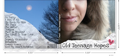
This is the front (right) and back (left) cover of my Digipak. I haven't changed it much at all since the draft because I was really happy and proud of what I'd accomplished. The changes I've made to this are - Artist name in heart; album name/artist on spine; copyright material and record label logos on back.
I've kept the colours really neutral and I believe they look slightly pure (Almost).
The front cover is probably one of my favourite images I've taken, because I just feel like it is pure emotion. While I was taking this photo I was trying to reminisce old summers, and being back with all my friends at my previous school. The note/crumpled paper, is suppose to represent the "passing/ leaving notes" theme.
This is the inside of my digipak. I've also added copyright material to this as well.
Unfortunately I couldn't find the original of the drawing of the watch, which is a shame. I think it's on my laptop at home, because I do not have all of the files on my college computer.
I've kept this simple as well.
On the left there are multiple images of textures and the artist, very lonely, looking out the window, thinking of old memories. Then the 3 bird - flying to signify freedom.
The right side is like the ash tray. Many people have commented on how "it doesn't relate" but I think it's more relevant. When I think of teenagers I think of parties, friends, memories, and smoking, rebelling etc. Therefore if the album is "Old Teenage Hopes" then this connotates the whole gritty, experience of being a teenager; maybe the artist used to sit on the school field with her friends and smoke? These are suppose to be echoing her memories.


I've added the copyright labels etc and the actually digipak at the bottom left as well. To relate to the digipak I've added the little hearts - 1 saying FEIST and the other explains what comes with the digipak.
I happy with this poster; I'd definitely stop and look at it, in HMV or even on the street.
The colour scheme is very simple, just like the whole campaign. The whole theme is very pure with a certain coldness to it. Like the memories, some could be so cold, and raw with emotion that this is whole they come across.
The font is also consistent throughout the whole campaign.
This is just a little something extra. This is a sample of the fold out lyric book.
I wanted the teenage, nature meets crumpled paper theme to run through still. I've used polaroids and the photograph of a phone number written on someone's arm, but then where it has come into contact with water/liquids half of the number's been rubbed off.
I love having that picture in there because that is such a common thing that happens to teenagers; you meet someone, they give you there number, email etc and you loose it or it gets destroyed. Therefore you're left with the uncertainty and not knowing feeling, that we've felt all felt, especially at some point while being a teenager.
The front cover to the lyric book will be the front cover of the digipak, because that is very common with other lyric books. The bonus DVD will be on the same disc as the CD.


No comments:
Post a Comment